Case Study
Website Redesign for a National Agricultural Real Estate Company
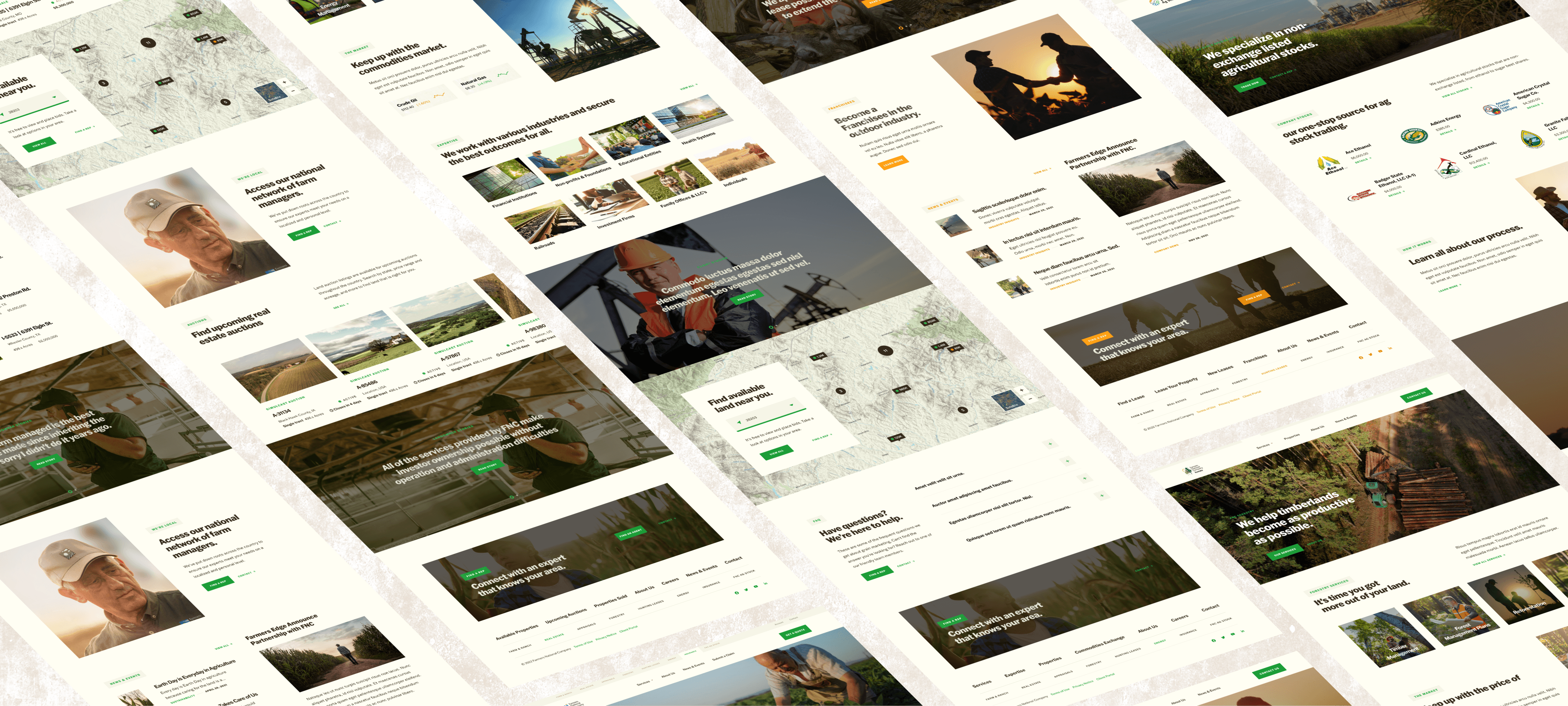
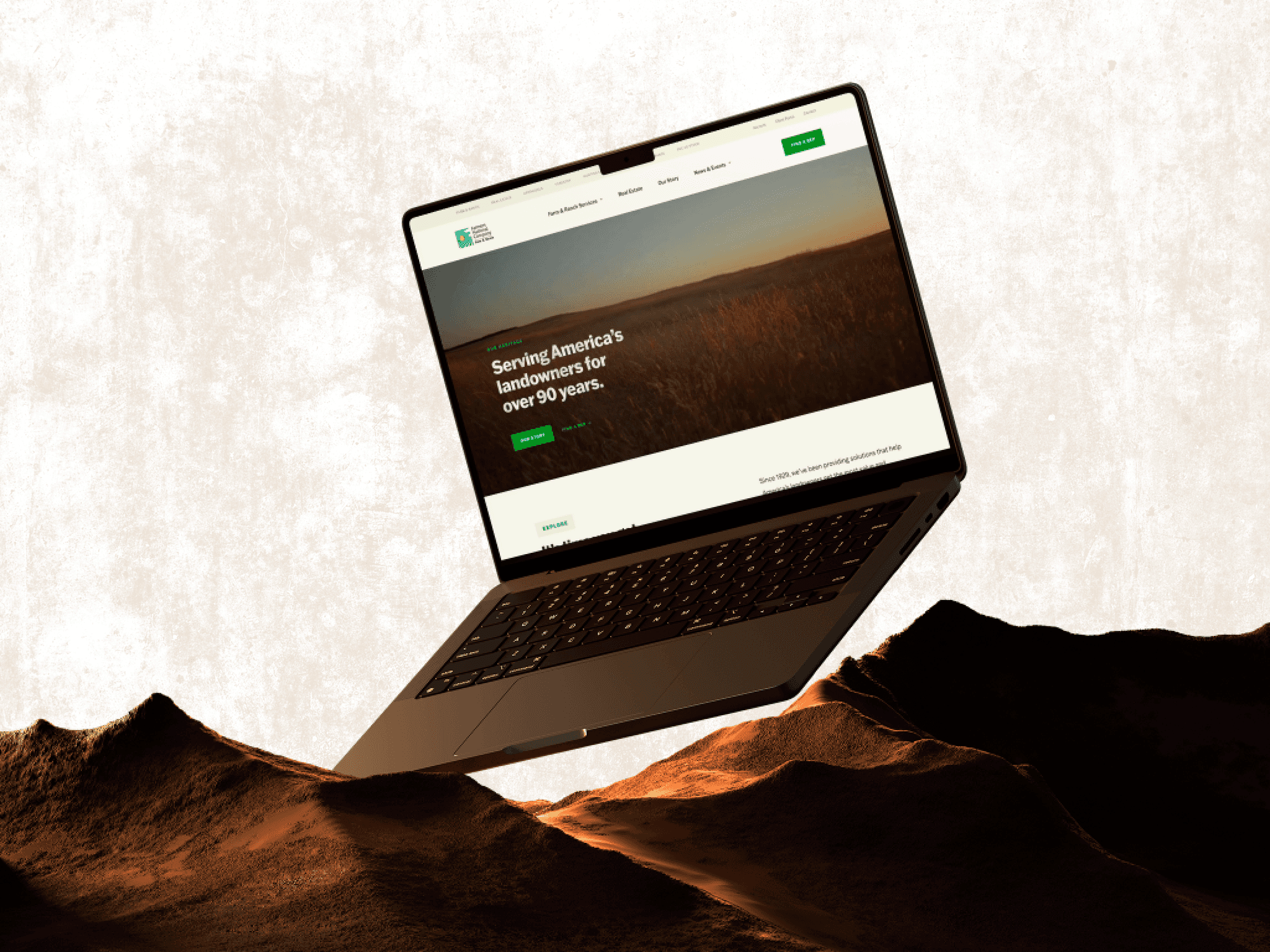
Farmers National Company, a leading agricultural real estate firm, approached us to revamp their family of 9 websites. Our team embarked on an extensive discovery, strategy and UX design phase, followed by a visual design and development process to bring the new websites to life.
Role
UX/UI Designer
Duration
3 Months
Team Members
Matt Sanchez (Senior Designer), Matt Taylor (Associate Creative Director)
Responsibilities
UX/UI Design, UX Research, Prototyping
01.
The Challenge
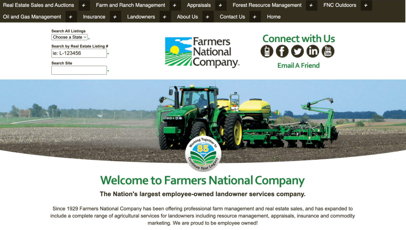
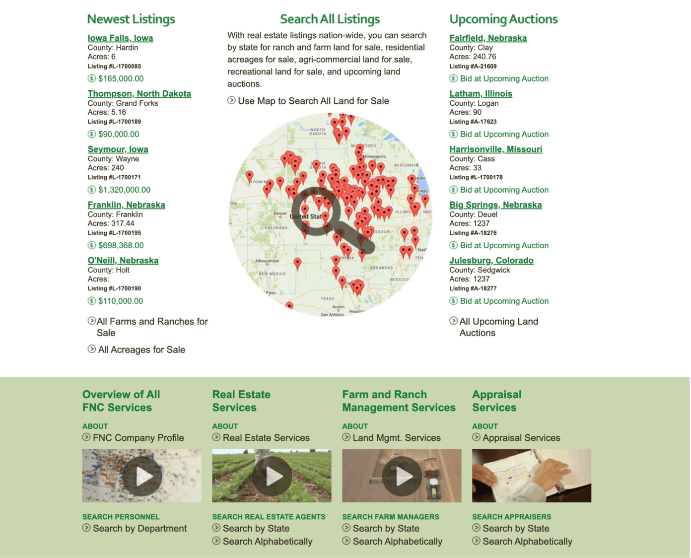
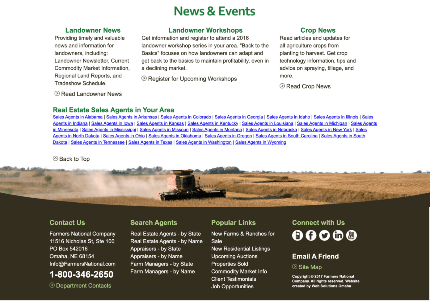
When we first set eyes on the Farmers National websites, it was clear that they were in desperate need of a design overhaul. The outdated look and feel of the sites harkened back to the early days of the internet, while the information architecture was a labyrinthine mess.
To make matters worse, the sites were not optimized for mobile devices, leaving users struggling to navigate on smaller screens. Each site had its own unique functionality requirements, and there were subtle brand differences that needed to be taken into account. It was evident that we had a significant challenge ahead of us.
02.
Discovery & UX Strategy
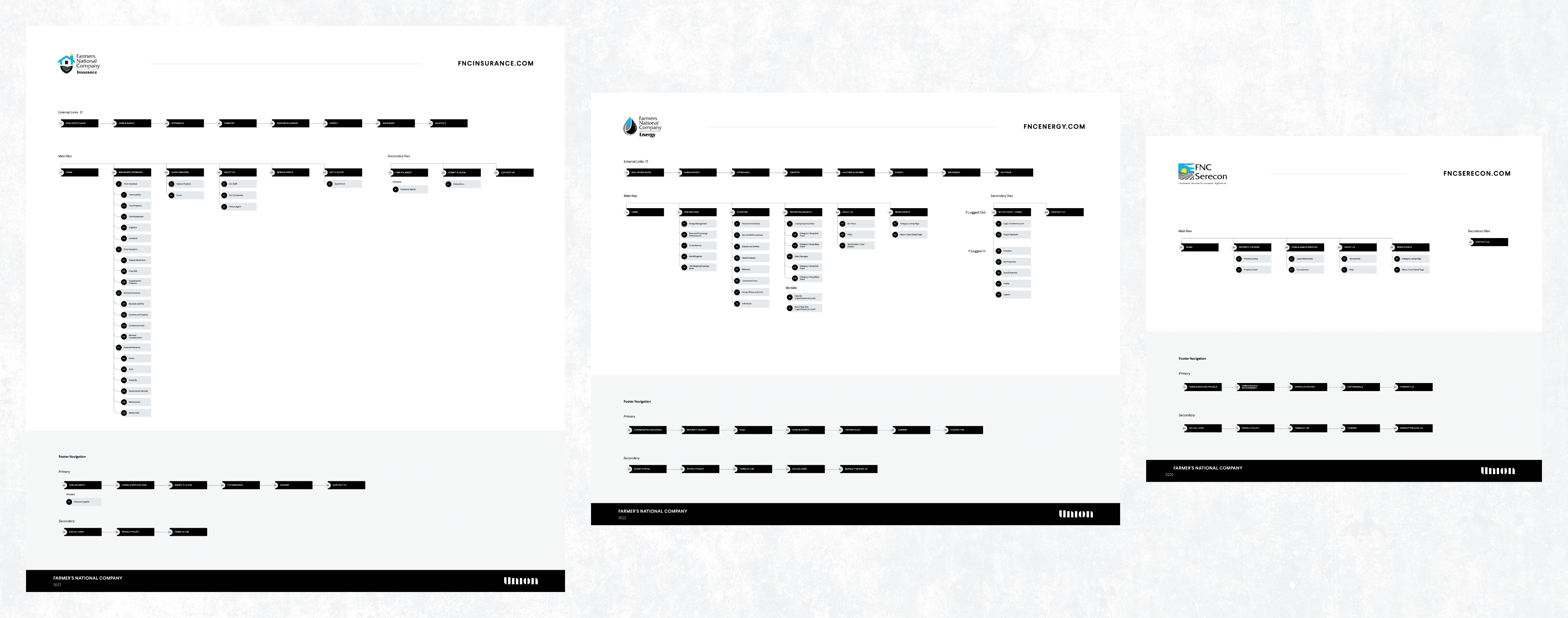
Our client operated in Residential and Business sectors, distinguished by their use of color and unique branding elements.
We ensured our design system was flexible and user-friendly by applying specific properties to each sector.
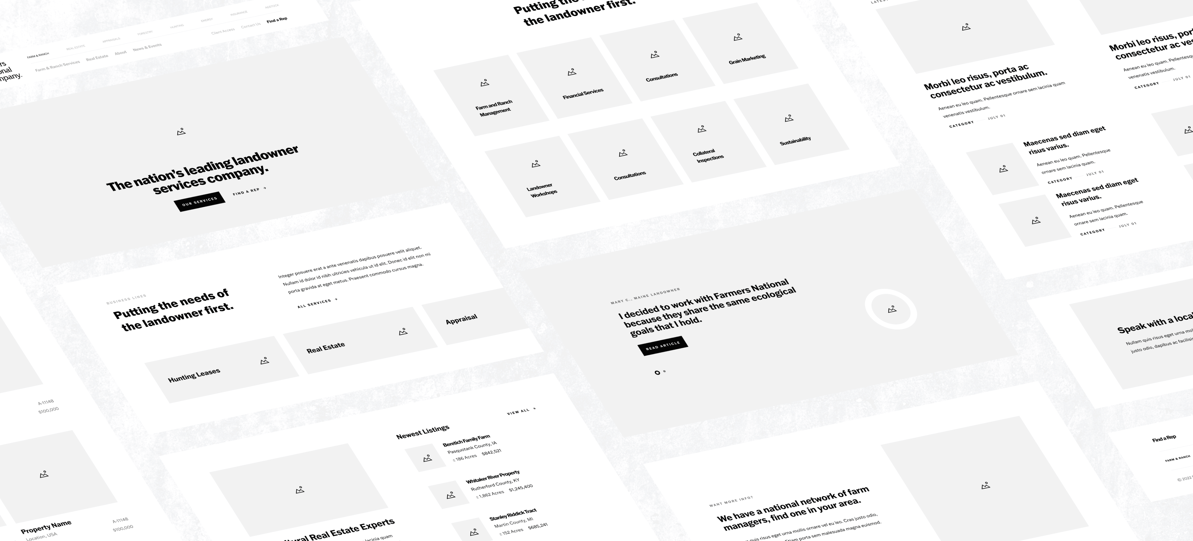
Wireframes
After getting approval on the sitemaps, I began designing content blueprints and wireframes. I chose to focus on screens with unique functionality as I had a limited number of screens to create.
03.
The Design
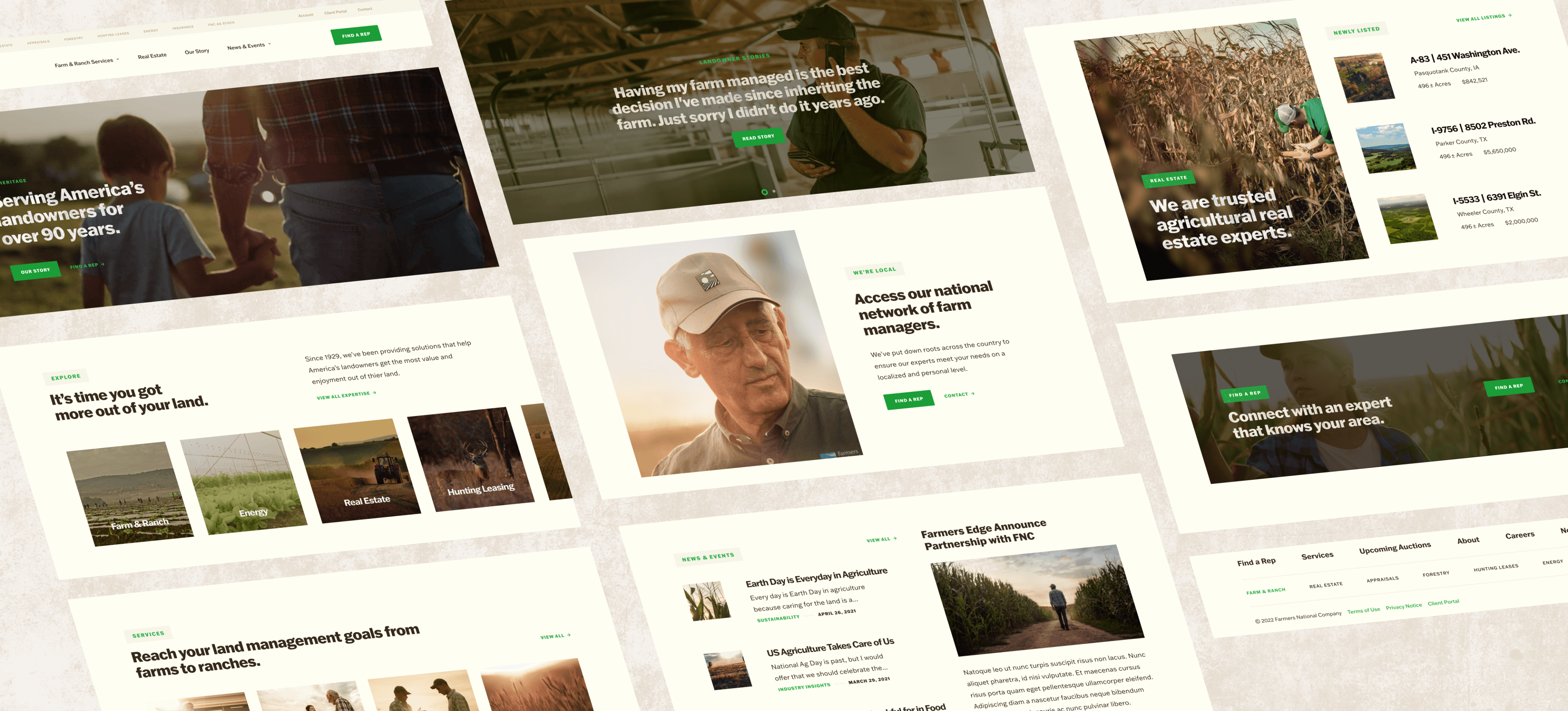
After the UX artifacts were approved, we moved on to the design phase. Our lead visual designers created two homepage directions for the client to choose from.
We then designed the corporate website, reusing components across all 9 sites for efficiency and consistency. Working with my team, we created responsive designs for the most important screens of each site.
FNC (Farm & Ranch), & FNC Real Estate
F&R Serves as the corporate website and a starting point for the more specialized company areas. RE Users are able to browse properties distinguished by their category, size, and prices.
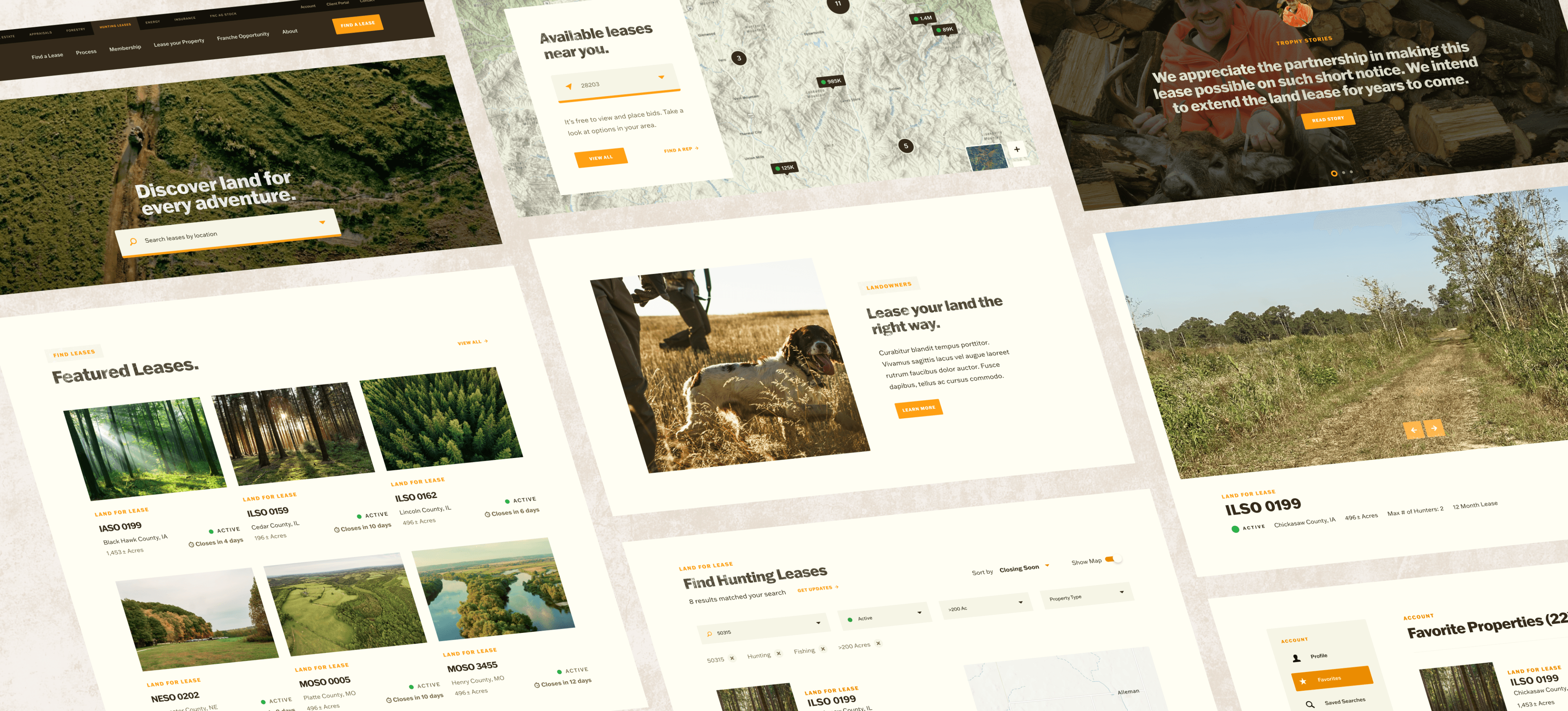
Hunting Lease Network
Built with a user account management system, this was arguably the most complex site we built. Users of the site would be able to edit their account, view their active leases, and save properties.
This site also used a different color palette than the rest, embracing a warm brown and orange.
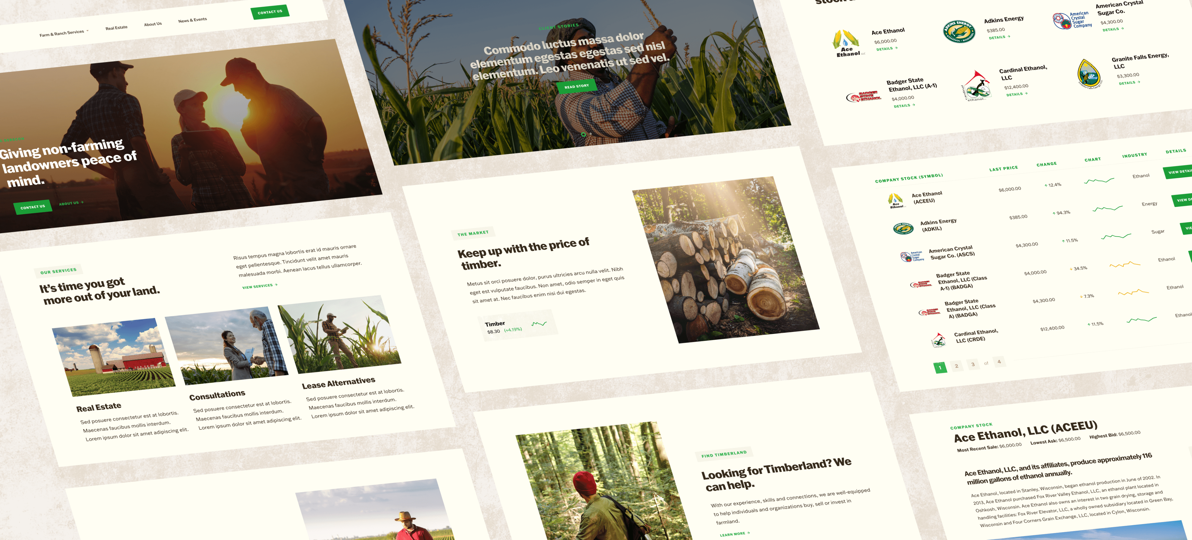
Serecon, Forestry, & Ag Stock
Marketing websites with the purpose of leading to a contact form.
Ag Stock and Forestry differed from the other sites as they both needed a price trending component.
04.
Wrap Up
The design of the 9 sites was a great success. The unique functionality of each website meant that I had to immerse myself and learn various different design patterns and conventions.
By redesigning the FNC websites, we increased page views, decreased bounce rate, improved user satisfaction and increased mobile traffic, resulting in a more engaging, user-friendly and accessible online experience.

